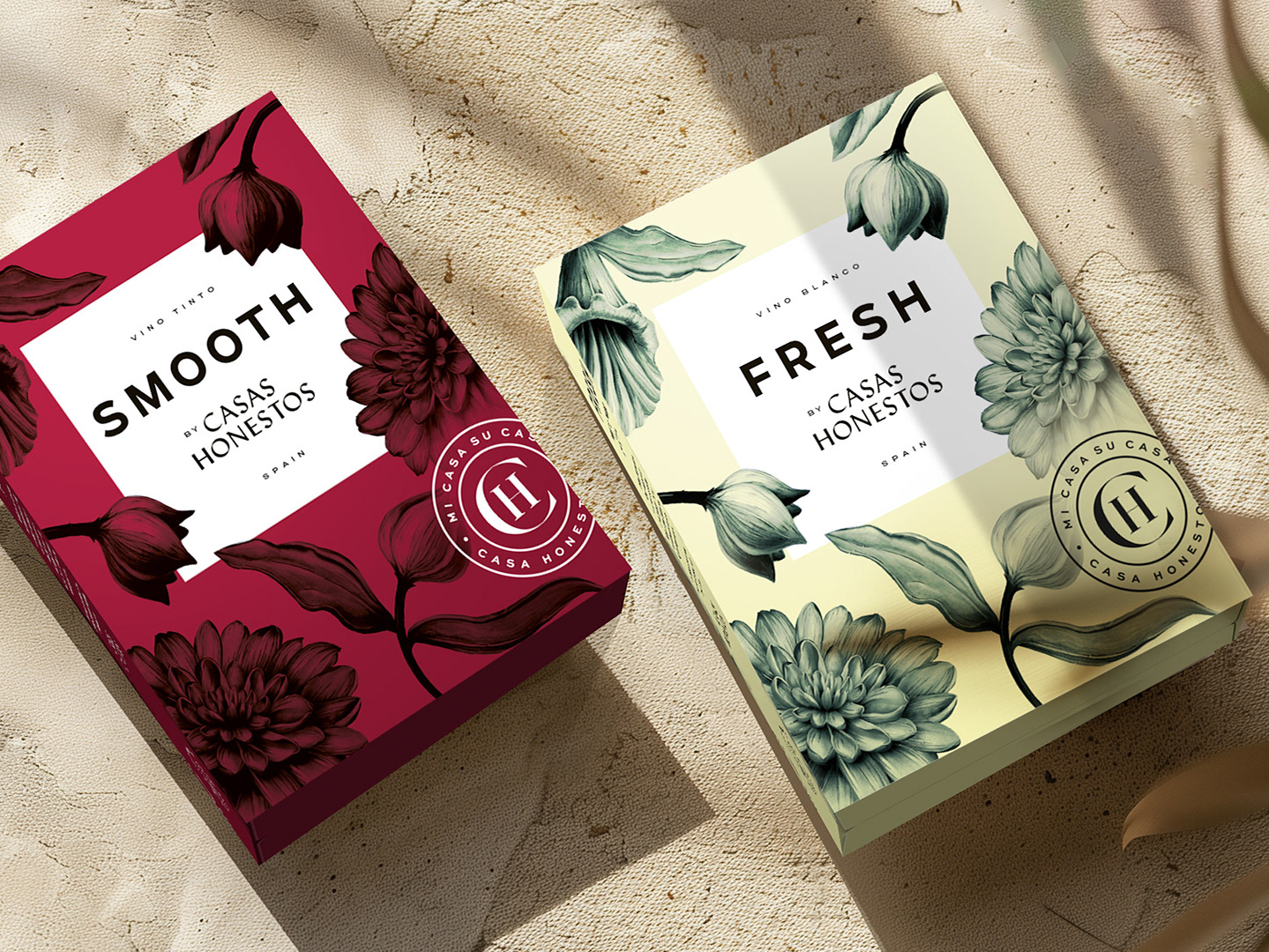
Where two sides of the world harmonise in a perfect match!
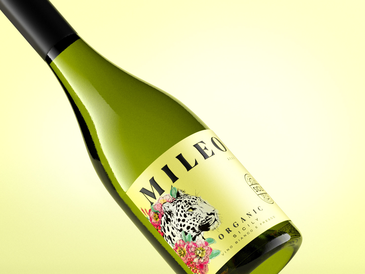
The task was to develop a brand for a series of European wines to be paired with Asian cuisine. The brand's feel should be Asian, without mistaking the wine for an Asian one. The expression should be crisp, educational, and minimalist. Where two sides of the world harmonise in a perfect match!
The result was a clear and minimalist design with Asian influences. Pictograms indicating which dishes the wine pairs with guide the consumer, and each bottle features its own branch with flowers growing into the label. Today, the series has expanded from three to eight wines, becoming a success story.
The brand achieved the prestigious silver award in Värmland's premier design competition of 2022.
Branding / Packaging design / Logotype
